Every year ONE DESIGN WEEK changes both in terms of content by concentrating on a particular theme and in terms of form – through its visual identity.
In 2016 we present to you a vision, created by Maria Mitcheva (MA Werkplaats Typografie / The Netherlands). The starting point of the new look is the different internal structure of the festival, i.e. the re-orientation towards and embracing of new fields / topics / audiences / ideas / interpretations, which though often looking chaotically scattered, are actually diligently ordered within a concrete framework.
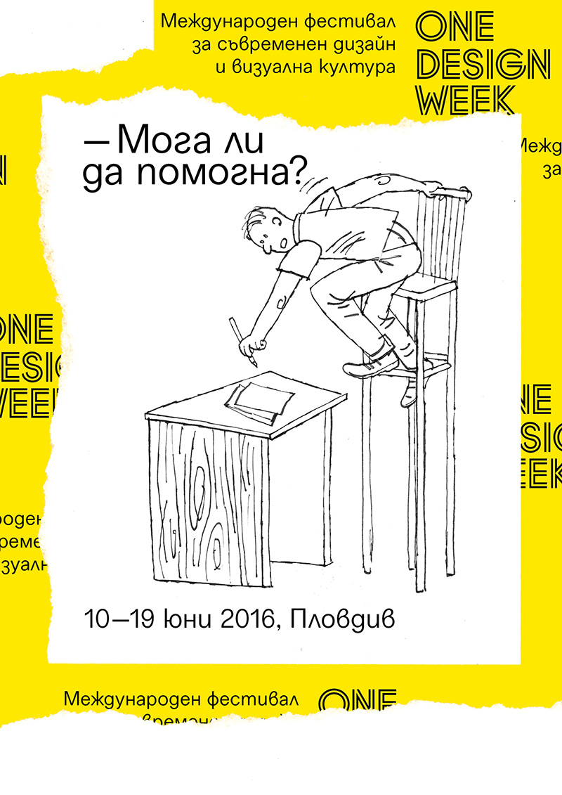
ONE DESIGN WEEK 2016 persistently asks the question – Can I help you? and that’s not because it wants to assume the role of some superhero (although it would have likeа that), but more in order to initiate a dialogue about the place of design here and now, i.e. in the contemporary society and culture. The visual identity incorporates 4 caricatures, created by Aleksey Klyikov, depicting various situations, in which design not only doesn’t help, but is actually completely disfunctional and even disturbs the conventional order in our everyday life. The caricatures illustrate the comical disparity and lack of correspondence between design, function and impact. Text and image influence each other in the creation of a narrative. But this narrative is also inspired by another tradition, namely the comics’ and more accurately the Bulgarian magazine Duga (which in Bulgarian translates literally as Rainbow).
The visual identity of the festival combines the use of the caricature as an instrument, which exaggerates or grotesquely distorts characteristic traits of humans or objects, and the comics as a system, which arranges and matches image and text. In view of the past, both genres share a longstanding tradition in being utilized for the sake of illustrating absurd and unreal situations in which humor is turned into direct means of interaction between author and reader. That is the exact desire of ONE DESIGN WEEK 2016 – through a faint self irony, to turn the attention to important elements of the everyday life, which could potentially be different – easier, faster and more interesting, as long as they are designed in the appropriate manner
As was already mentioned, the graphic design is inspired in part by the comic tradition with its panel structure and by the idea that the separate illustrations combine into a homogenous whole, but can at the same time be cut and rearranged, thus creating yet other diverse wholes with alternative messages. In this way the logotype of ONE DESIGN WEEK turns into a repetitive motif, which symbolizes the history and the tradition of the festival, but rearranged. The festival is a collage of different narratives, to which the narrative of 2016 is being added, but its story is yet to unfold.

Maria Mitcheva is a freelance graphic designer, currently following the Master programme Wekplaats Typographie in Arnhem, The Netherlands. Previously she worked in Berlin for Laurentz Brunner – art director and font designer, right after graduating from her Bachelor’s degree in Graphic Design at Rietveld Academie, Amsterdam. Her thesis centers on the specific characteristics of the Bulgarian Cyrillic alphabet and its possible future. She is interested in typography – its perception and the interaction with it in a digital environment.